By Tom Lancaster and Stephen J. Blundell
Sometimes it’s the fly in the ointment, the thing that spoils the purity of the whole picture, which leads to the big advances in science. That’s exactly what happened at a conference in Shelter Island, New York in 1947 when a group of physicists gathered to discuss the latest breakthroughs in their field which seemed at first sight to make everything more complicated.
Isidor Rabi reported experimental results from Columbia University that showed that the g-factor for the electron, a property reflecting its magnetic moment, was not precisely two, as Paul Dirac’s beautiful theory of the electron had predicted, but came out to be a messy 2.00244 (though the modern value is very slightly lower than this). And Willis Lamb, also at Columbia, explained how two energy levels in the hydrogen atom which were supposed (again according to Dirac) to be coincident were very slightly displaced from each other (an effect now known as the Lamb shift).
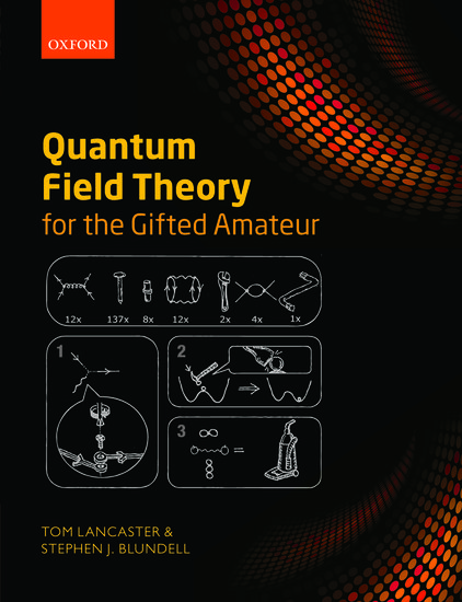
These were apparently messy, annoying and disruptive results that ruined a pure, dignified and elegant theory. But physicists like a challenge, and the conference attendees included Hans Bethe, Julian Schwinger, and Richard Feynman, all three of whom would attack the problem. The key insight was to realize that there are a multitude of quantum processes that can occur, and which had been forgotten. An electron is not just an electron, but is surrounded by a cloud of virtual particles: photons, electrons, and antielectrons, popping in and out of existence. These higher order processes are most pictorially described by Feynman diagrams, simple cartoons containing dots, arrows and wiggly lines, each one a shorthand for a mathematical term in a complex calculation but summarizing a physical interaction in an elegant form.

These diagrams can be used to show how the basic interaction between electrons and light is altered by quantum processes, an effect which tweaks its magnetic moment. This slightly shifts the “g-factor” and gives a prediction which has been verified experimentally to many decimal places. It also affects the way in which the spin and orbital angular momentum behave and this can be used to explain the Lamb shift. These tiny effects signal a vacuum that is not empty but teeming with quantum life, myriad interactions shimmering around every particle
Feynman diagrams first appeared in print sixty-five years ago this year, so they have now reached statutory retirement age. But rather than being put out to grass, Feynman’s cartoons are still used to make calculations and describe physical processes. They are at the foundation of modern quantum field theory, and if we ever figure out how to make a theory of quantum gravity, it is pretty likely Feynman diagrams will be in the description. It’s a reminder of why detailed measurements are needed in physics. Those little discrepancies can lead to revolutions in understanding.
Tom Lancaster was a Research Fellow in Physics at the University of Oxford, before becoming a Lecturer at the University of Durham in 2012. Stephen J. Blundell is a Professor of Physics at the University of Oxford and a Fellow of Mansfield College, Oxford. They are co-authors of Quantum Field Theory for the Gifted Amateur.
Subscribe to the OUPblog via email or RSS.
Subscribe to only physics and chemistry articles on the OUPblog via email or RSS.
Recent Comments
There are currently no comments.